Aviation Safety Visualization
intro: | Authors: Junkai Man, Rundong Hu, Zichao Chen
💡 The online vis on Tableau Public can be found here
content_layout:
-
section_layout: 5col-7col images:
- url: '/projects/aviation-safety/aviation-safety.png'
- url: '/projects/aviation-safety/screenshot.png'
-
section_layout: text content: |
Introduction
The airplane is one of the most important long-distance transportation vehicles in the world. And recent aviation accidents have aroused great public concerns about aviation safety (Buckley et al., 2022). Last month, flight MU5737, which nose-dived into a mountain killing all 123 passengers and 9 crew members in Wuzhou, China (CCTV English, 2022), again brings public’s attention to aviation safety issues. Due to these reasons, our group chose the “World Airplane Accident Statistic Visualization” as our topic. We hope these visualizations will help the public intuitively understand the status of aviation accidents and give some insights for researchers and technicians to further investigate and improve aviation safety.
We designed a three-step exploration approach to explore the aviation accident data and generate visualizations. The exploration questions include three aspects: “What? Which? Why?”. We used these three aspects as the logic line to get insight into the airplane accident. The detailed questions are:
- What is the trend of airplane accidents around the world in recent years?
- Which airplanes have a higher number of accidents?
- Why did these accidents happen? i.e. The cause of the accident.
-
section_layout: text content: |
Method
Data Collection, Clean, Filter
The data was collected from two sources: planecrashinfo.com and the National Transportation Safety Board (NTSB) website Case Analysis and Reporting Online (CAROL) system. The NTSB is a federal agency focusing on investigating every civil aviation accident and other significant modes of transportation in the United States (National Transportation Safety Board, 2022). They can also provide aid to other nations in investigations of accidents of aircraft with U.S.-made components (National Transportation Safety Board, 2022). The merged data provide more than 20k entries of airplane accident data from 1982 to 2022. In order to reduce the naming inconsistency for string data, we first stripped out the blank spaces at the beginning and the end and then converted them to uppercase. Since our goal focuses more on civil aviation accidents, we filtered out the data by the following criteria: aircraft category should be “airplane”, the number of aircraft seats should be greater or equal to 5, and only the dominant accident cause was preserved. The duplicated entries were dropped by “accident date”, “accident location”, and “accident operator”. And the final processed data consists of 15600 entries and 32 attributes. We also created some calculated fields for better visualization (e.g., fixed model, which aggregates the aircraft for Boeing and Airbus).
Data Analyze and Visualization
We separated the visualizations into the following 3 parts and created 5 graphics to achieve the tasks.
- The historical trend: A heatmap presenting the historical trend by year and month. A line chart showing the accident level by year.
- The fatalities by airplane model: A treemap visualizing the fatality in each aircraft, aggregated by time, and categorized by aircraft makers.
- The statistic of accident causes: A word cloud generalizing the accident cause. A Sankey chart analyzing the relationship between weather and cause.
-
section_layout: text content: |
Results
The historical trend
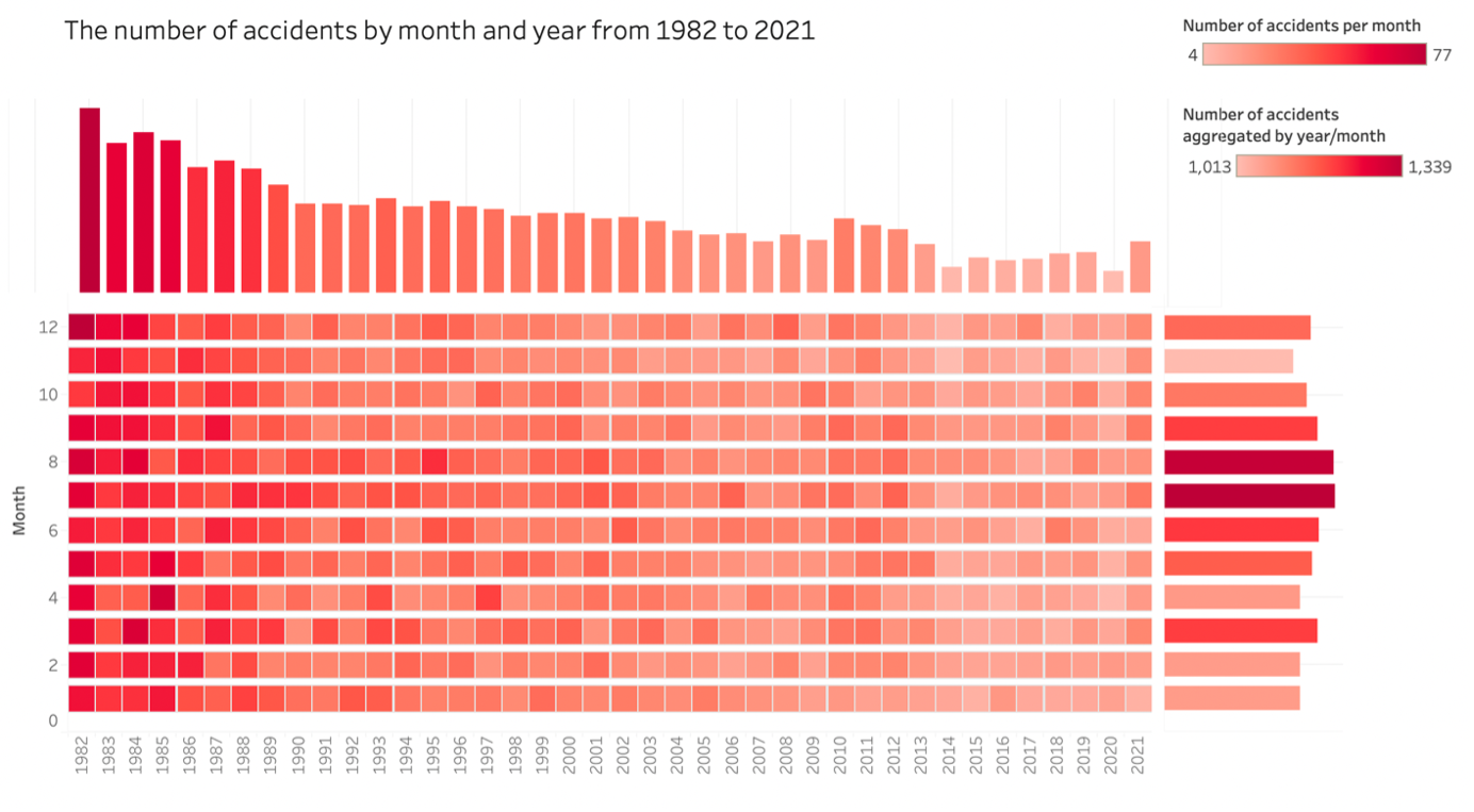 The center heatmap shows the monthly accident numbers from 1982 to 2021. Different amounts of luminance indicate the number of accidents. Bar charts in the margin aggregate the data by year and month respectively, showing that the accident amount is decreasing in recent years and July and August are the worst months for accidents historically.
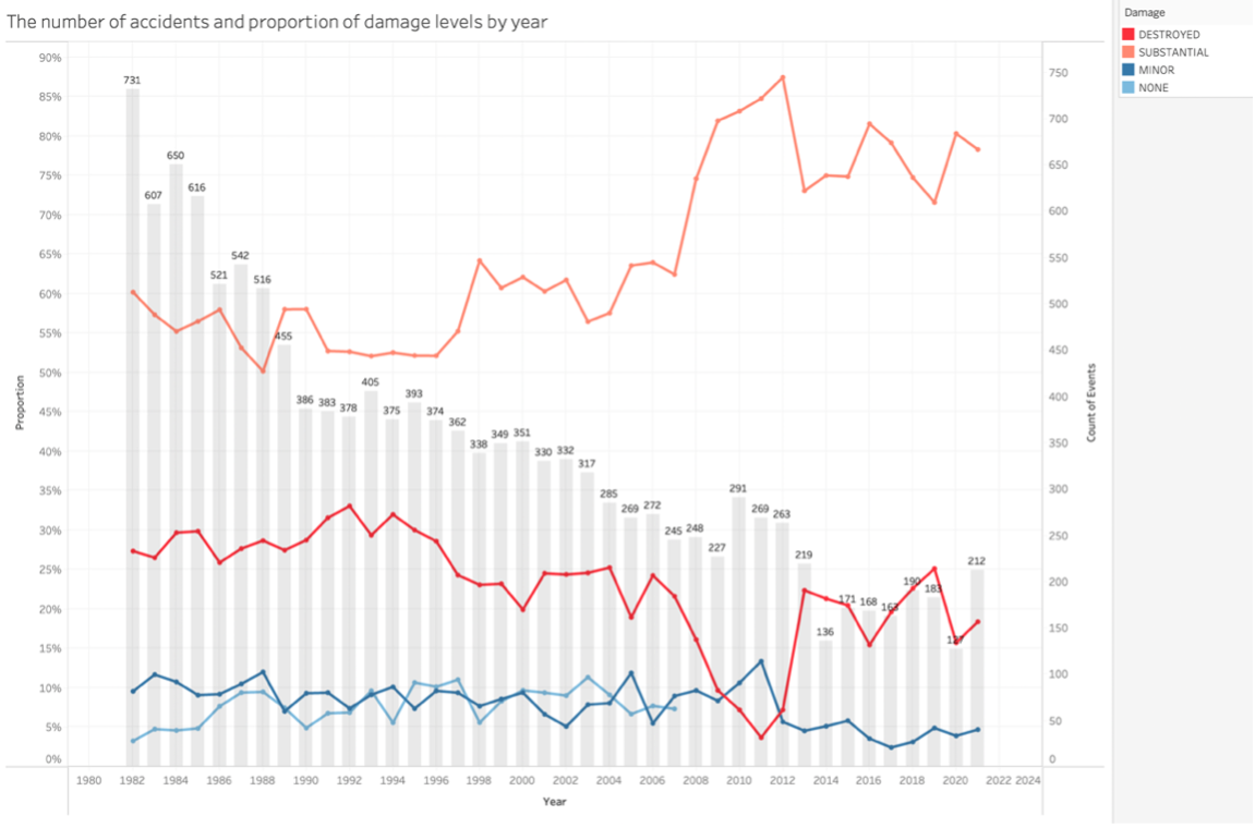 A combined bar & line chart shows the damage distribution and the number of accidents each year. The lines with four different colors show the proportion of each accident damage level accidents in that year and the bar chart shows the number of accidents. It demonstrates the fact that although the total number of accidents is decreasing, the proportion of substantial damage accidents is increasing in recent years.
The fatalities by airplane model
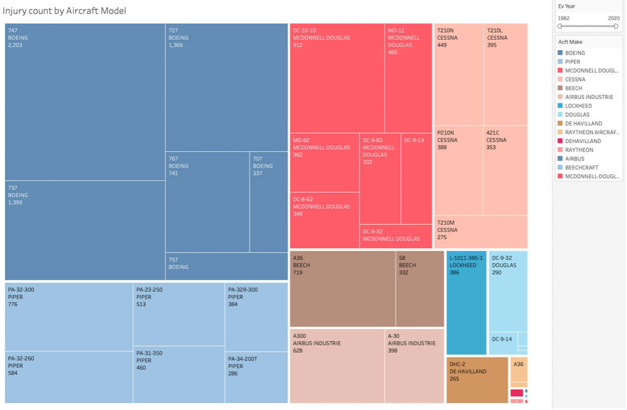 The treemap shows the top 30 aircraft models that have caused the highest number of casualties in the dataset. The color categorizes different aircraft makers, and the area size represents the number of fatalities. It shows that the Boeing company and Boeing-747 have caused the highest casualties among the aircraft makers and aircraft models.
The statistic of accident causes
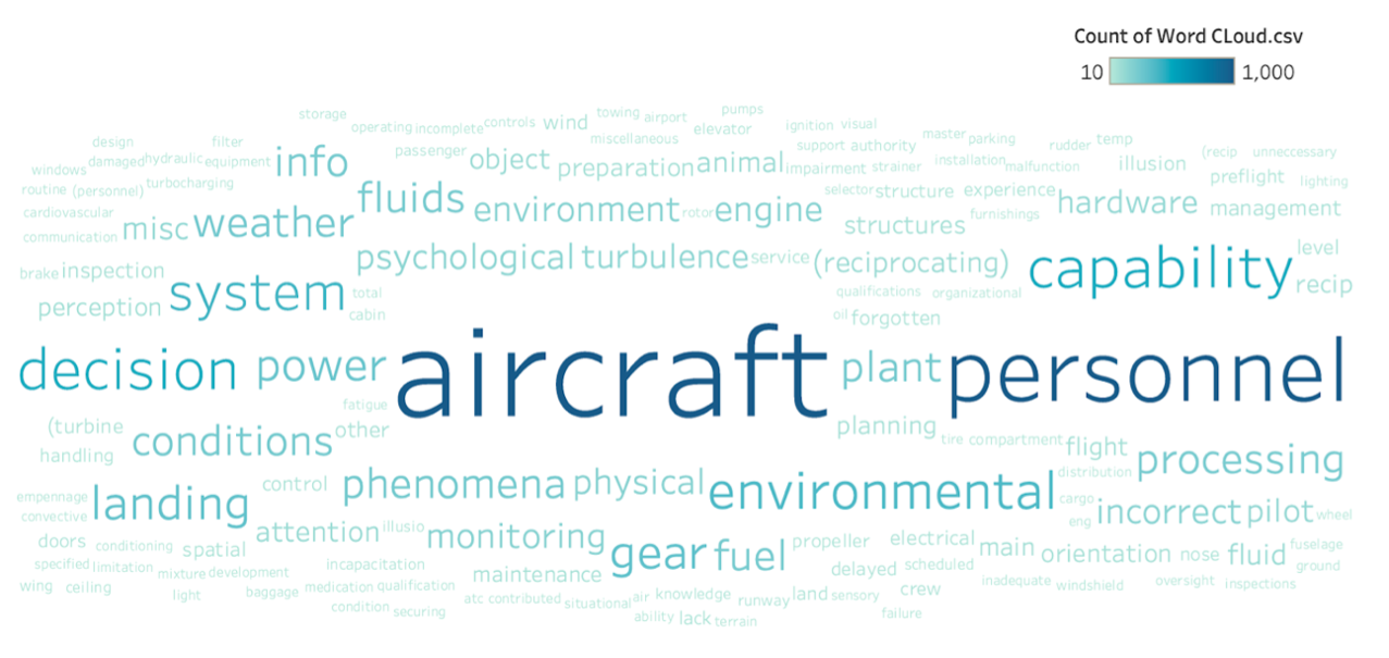 The word cloud is derived from accident reports. Insignificant words were filtered out before creating the figure. The size of each word indicates its frequency. It reveals many important factors in aviation safety such as “personnel”, “capability”, “hardware”, “decision”, and “environmental”. The “aircraft” and “personnel” are the two most frequently mentioned words in accident reports. This may indicate that the aircraft and personnel issues are the major causes of the accidents.
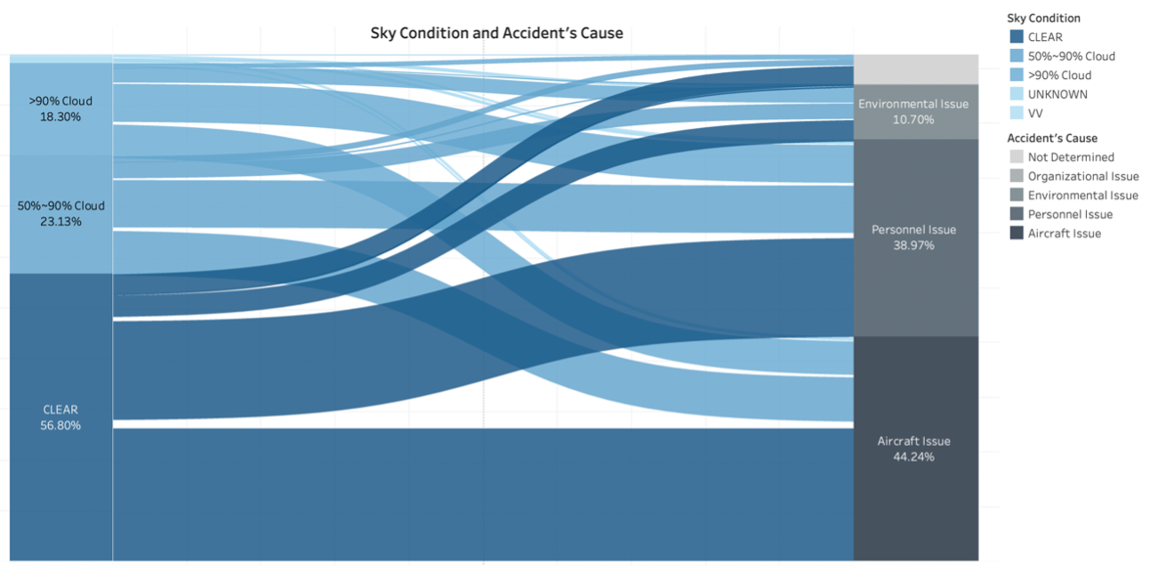 The Sankey chart visualizes the relationship between the sky conditions on the left and accident causes on the right. The flow widths represent the proportional quantity belonging to each of these two variables. It shows that when the sky condition is clear, the accident cause tends to be aircraft issues more than personnel issues.
Published: 2020-12-13